Best YC startup websites, and what they do on the homepage
 Sharzil AlveFounder, Amani Studio · 11 min read
The best YC startup websites say what the product does in under seven words, show the real product on the first screen and put proof right next to one clear button. We studied the homepages of 10 Y Combinator companies, from Stripe to this year's batches, next to what YC's own partners tell founders. Here is what they do, and how to do it on yours.
In short
- Say what it is in under seven words. All 10 headlines we studied are seven words or fewer; the average is under five.
- Show the product, or let people try it. Replit, Vapi and PostHog put a working product on the first screen.
- One main button, with proof right beside it. Logos, a user count or a live number, never a carousel.
- Clarity first, personality second. PostHog can look like a desktop computer because its first line is already clear.
What makes a great YC startup website?
A YC startup's homepage has one job: make a stranger understand the product in a few seconds, then take one step. The best ones do it with four things on the first screen.
1. A headline that names the product, in plain words a buyer would use. 2. A line that says who it's for and what changes. 3. One main button, with the second only for sales or docs. 4. Proof next to the button: customer logos, a user count or a number that is live.
That matches what YC's own partners say in their Design Review series, where they critique founders' websites on camera. In one episode Aaron Epstein and Garry Tan explain why copy that's too clever backfires, and why you should get people to a live demo quickly and "show off a feat of strength". In another, Aaron and Pete Koomen, who cofounded Optimizely, argue for one clear call to action, a faster route to the "Aha!" moment, less friction at sign up and no animated slides.
The 10 homepages we studied
We picked 10 companies from Y Combinator's own startup directory: famous ones that set the pattern, and AI startups from the last few batches that founders compare themselves with today. We read each homepage on a 1440 pixel desktop screen on 14 November 2026 and wrote down what the first screen says and shows.
| Company | Headline | What the first screen does |
|---|---|---|
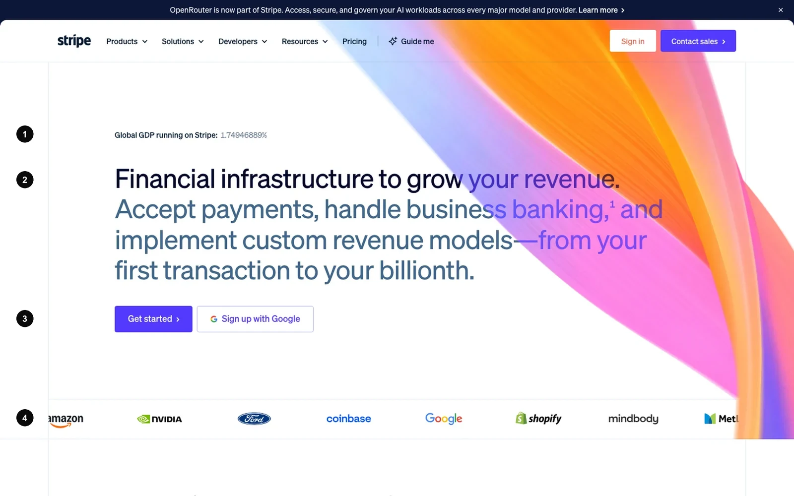
| StripeSummer 2009, payments | Financial infrastructure to grow your revenue. | Live proof line, customer logos under the button |
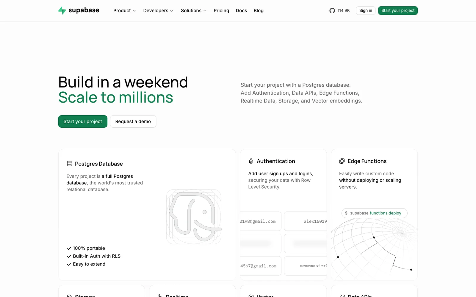
| SupabaseSummer 2020, database | Build in a weekend. Scale to millions. | Product cards for each feature, right away |
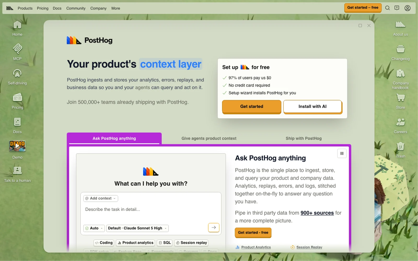
| PostHogWinter 2020, analytics | Your product's context layer | Ask the product a question; "97% of users pay us $0" |
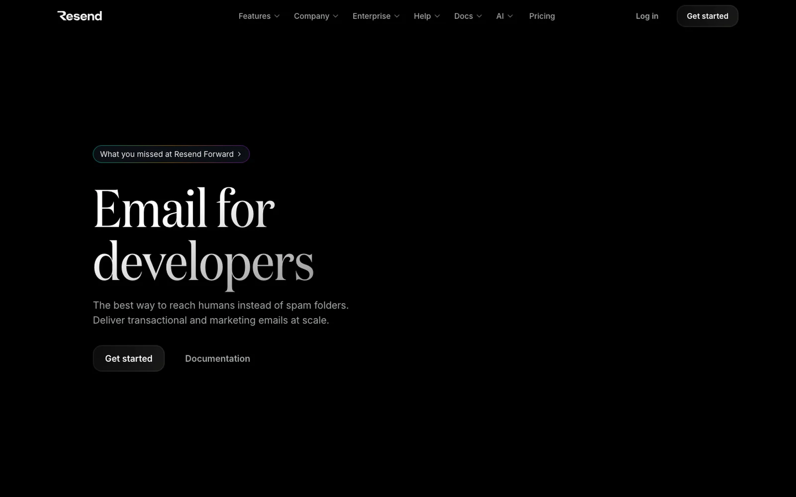
| ResendWinter 2023, email API | Email for developers | Three words, one button, the docs beside it |
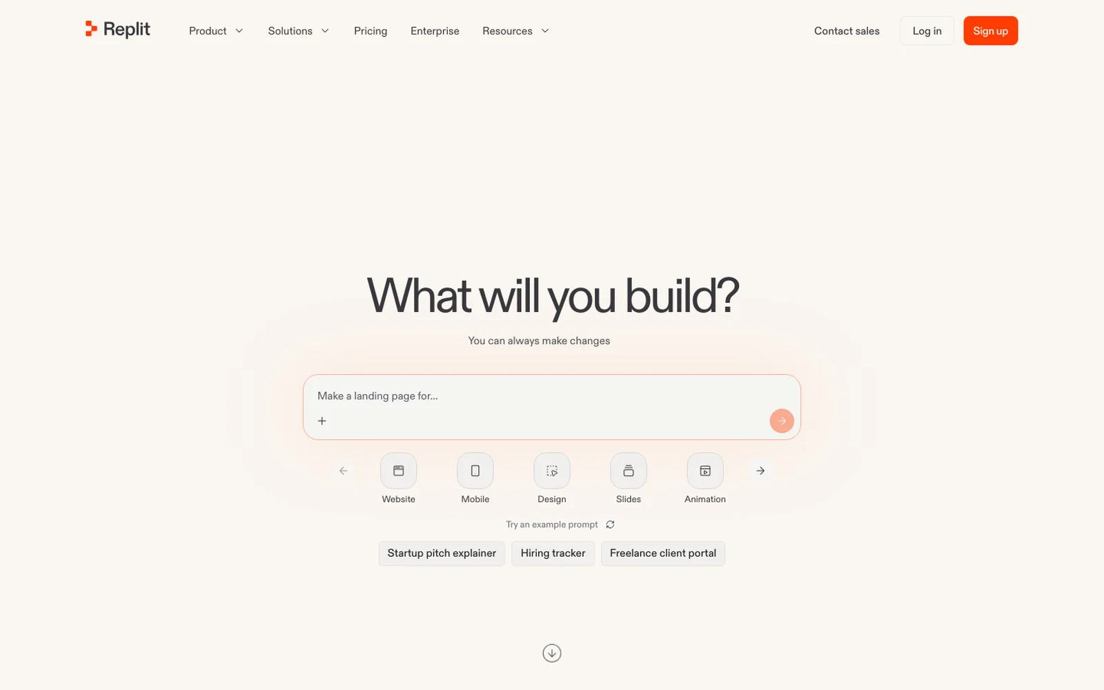
| ReplitWinter 2018, AI app builder | What will you build? | The first screen is the product: a prompt box |
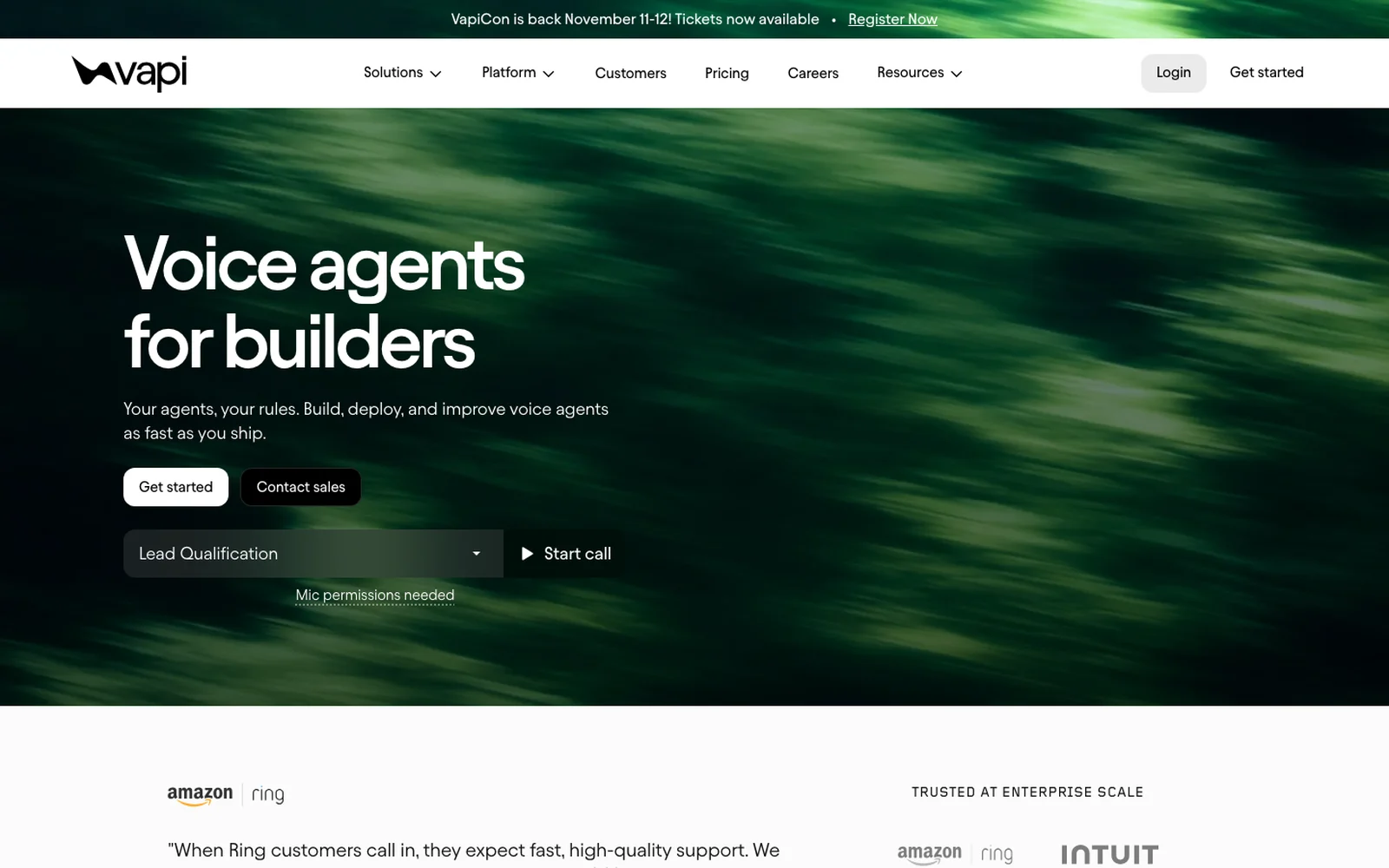
| VapiWinter 2021, voice AI | Voice agents for builders | Start a live call with a voice agent |
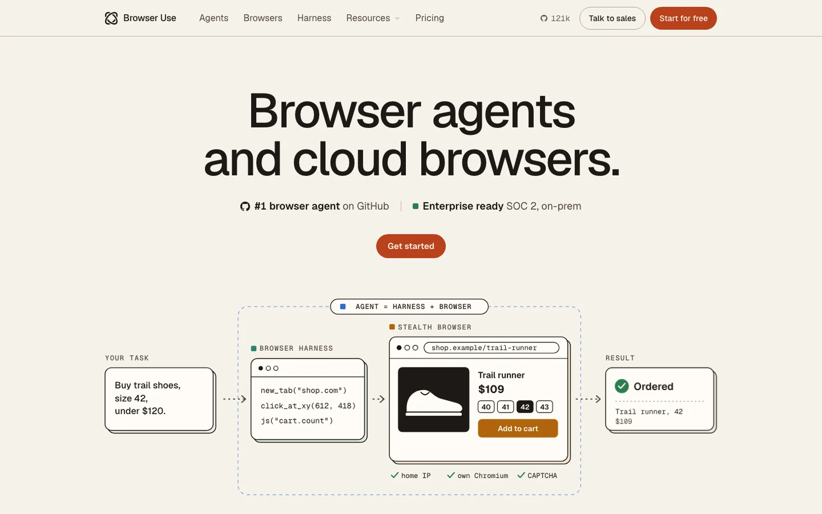
| Browser UseWinter 2025, browser agents | Browser agents and cloud browsers. | A diagram from your task to a finished order |
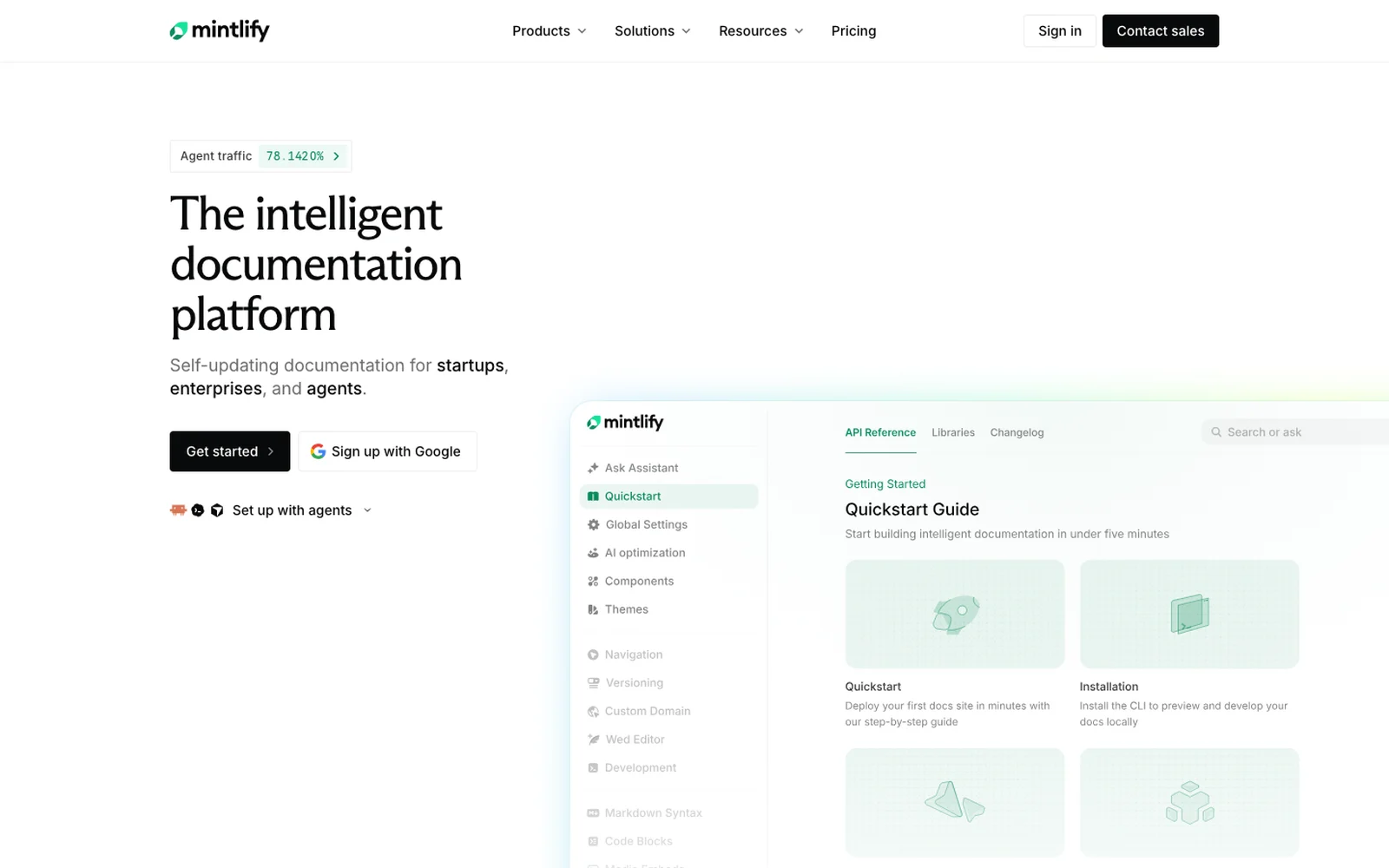
| MintlifyWinter 2022, documentation | The intelligent documentation platform | The real docs product, with an agent traffic figure |
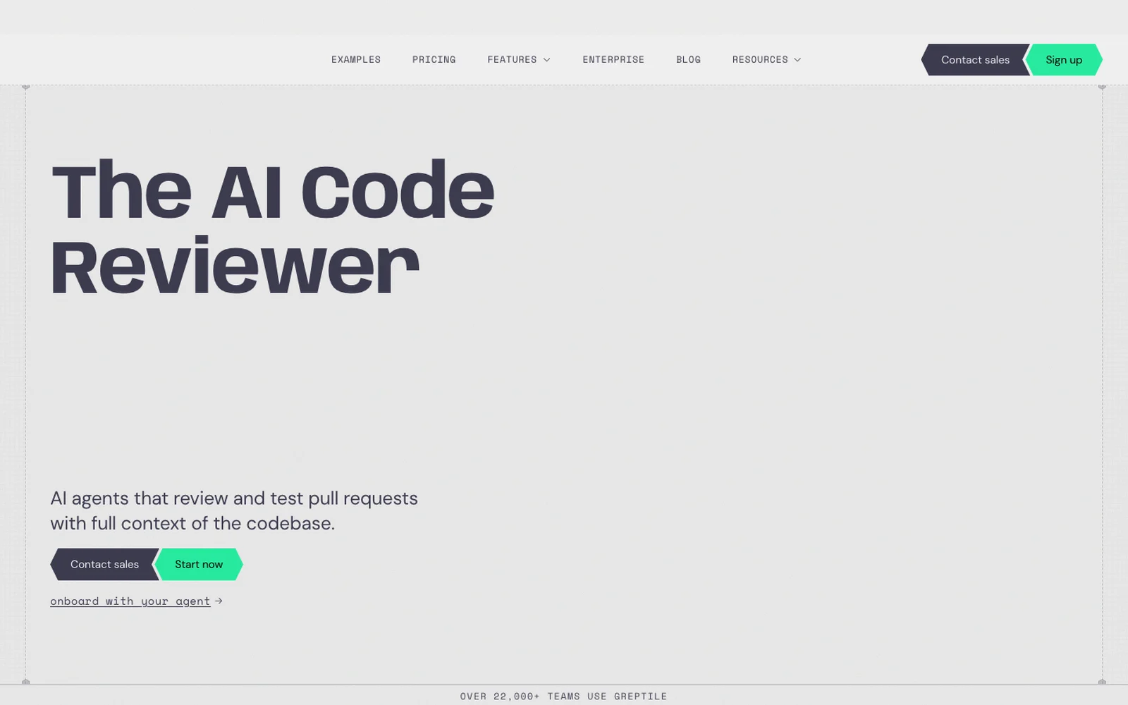
| GreptileWinter 2024, AI code review | The AI Code Reviewer | Names its category; "22,000+ teams" as proof |
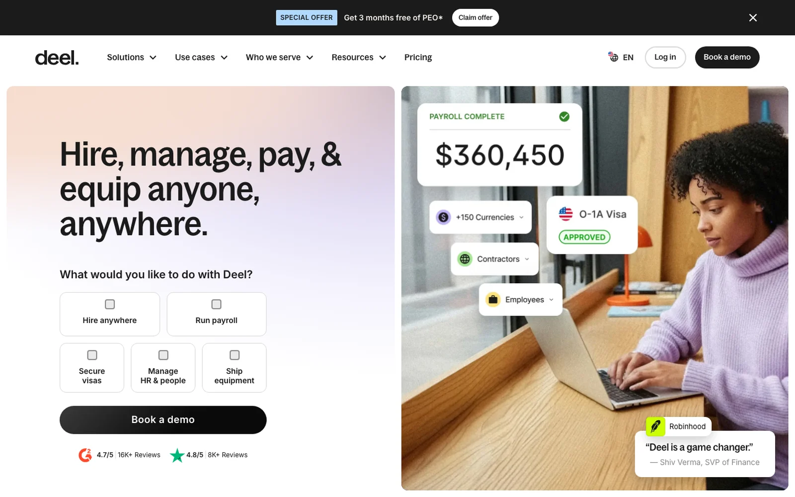
| DeelWinter 2019, HR and payroll | Hire, manage, pay, & equip anyone, anywhere. | Asks what you want to do, then routes you |
Batches are as listed in YC's directory. Headlines are as shown on each homepage that day; they change often.
1. Say what it is in under seven words
Not one of the 10 headlines is a slogan. Greptile's is the name of its category, "The AI Code Reviewer". Resend's is three words that tell a developer they're in the right place. Vapi's tells you the product and the buyer at once: voice agents, for builders.
This is the mistake we see most on early sites: a headline about a feeling ("Work, reimagined") that could belong to any company. A visitor who can't tell what you sell in a few seconds doesn't scroll to find out. If you're unsure, read your headline to someone outside your industry and ask them what you sell.
2. Show the real product, not an idea of it
Supabase puts its product on the first screen as cards: Postgres Database, Authentication, Edge Functions, each with a line on what it does. Mintlify shows its actual documentation product in the hero, not an illustration of it. A founder or engineer sees exactly what they'd be buying.
Abstract 3D shapes and stock photos ask the visitor to imagine your product. A real screen, cropped well and kept sharp, does the explaining for you.
3. Let them try it before they scroll
This is YC's "feat of strength" in practice. Replit's homepage is a prompt box asking "What will you build?", with example ideas to click. Vapi lets you pick a use case and press Start call to talk to one of its voice agents, right from the hero. PostHog has an "Ask PostHog anything" box on its first screen.
For an AI product this is the strongest move there is. Nobody believes "powered by AI" any more; everybody believes a demo that answers them. If a live demo isn't possible, a short, real recording of the product doing its job is the next best thing. YC's partners do warn that a confusing demo is worse than none, so keep it to one task that works every time.
4. One main button, and no reason to hesitate
Stripe pairs Get started with Sign up with Google, so a new account takes one click. PostHog puts three lines next to its button: "97% of users pay us $0", "No credit card required" and that a setup wizard installs it for you. Each line answers a worry before the visitor has it.
That's Pete Koomen's point on friction: every field and every doubt between the visitor and the "Aha!" moment costs sign ups. One main button, said the same way across the page, with the most common worry answered right beside it.
5. Put proof where the decision happens
Every one of the 10 shows proof on the first screen or straight after it. Stripe has logos from Amazon to Shopify under its buttons and a live line on how much global GDP runs on Stripe. Greptile says more than 22,000 teams use it. Browser Use puts two chips under its headline: the number one browser agent on GitHub, and enterprise ready with SOC 2. Deel puts review scores under its Book a demo button.
An early startup won't have Amazon's logo yet, and that's fine. Proof scales with you: design partners' logos, a waitlist count, a quote from a pilot customer, a benchmark you can show. What matters is where it sits: next to the button, not in a section nobody reaches.
6. Route each buyer, once you have more than one
Deel serves founders, HR teams and finance teams, so its first screen asks "What would you like to do with Deel?" and offers five answers: hire anywhere, run payroll, secure visas, manage HR, ship equipment. Each buyer finds their page in one click, and the headline stays short.
At seed stage you usually have one buyer, and you should write for them alone. Add a chooser like Deel's when sales tell you two kinds of buyer keep asking different questions.
7. Personality comes after clarity
PostHog's site looks like a desktop computer, with icons, windows and a grassy wallpaper. It works because the first window already says what PostHog is and who uses it. Resend's dark, editorial look and Stripe's colour wave are the same idea: a strong brand on top of a clear message, never instead of it.
That order matters for a young company. A distinctive look makes you remembered after Demo Day; a clear headline makes you understood during it. You need both, and clarity comes first.
How do we design startup websites like these?
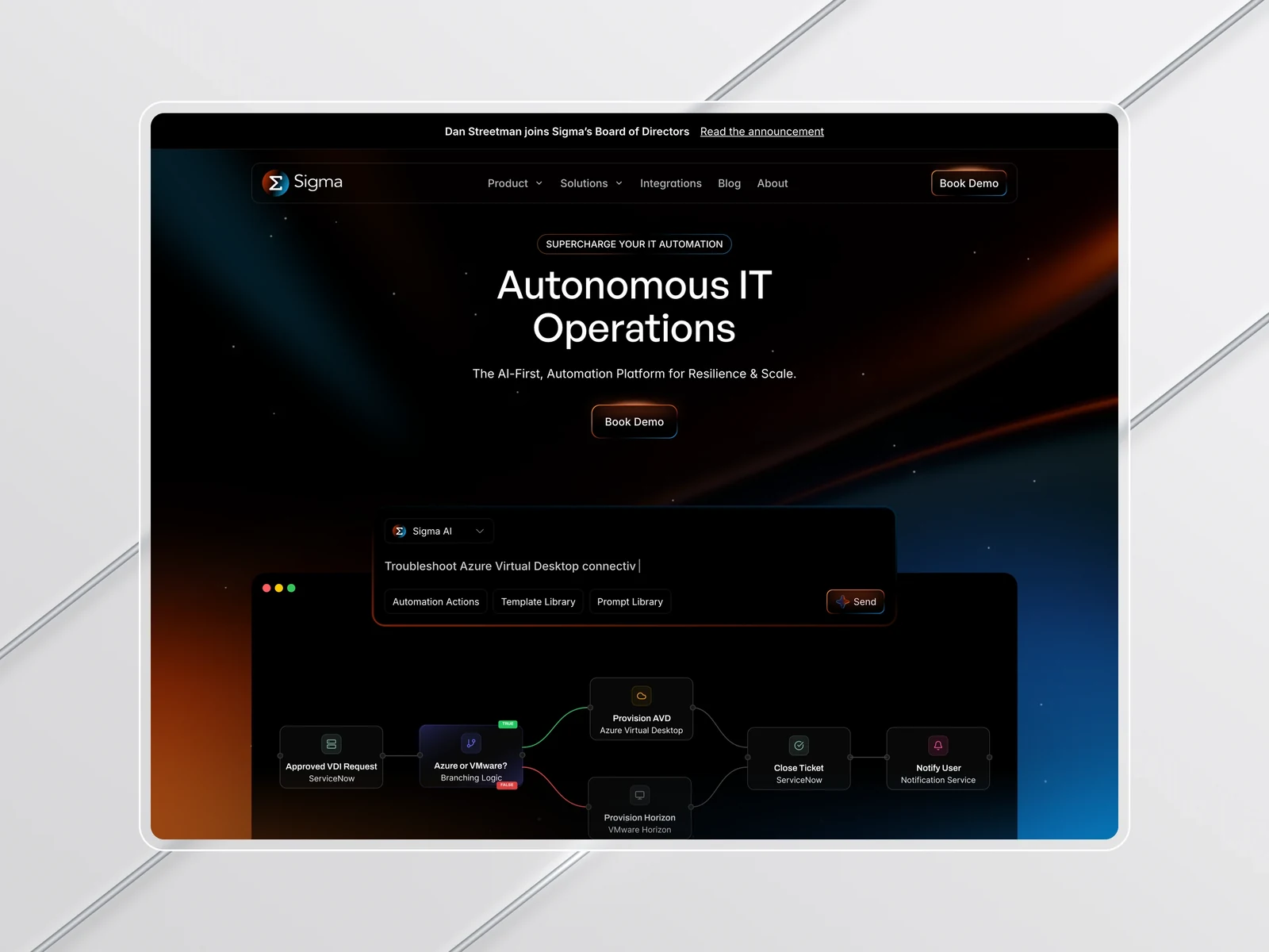
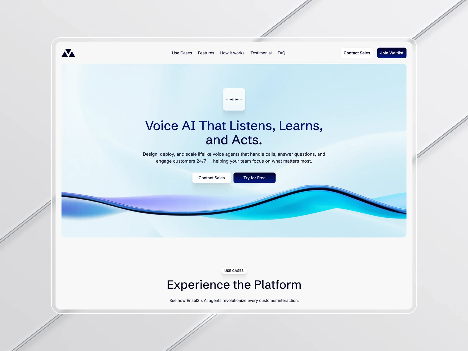
These are the same rules we design by for SaaS and AI startups. For Sigma, an AI platform for enterprise IT, we made a deep product easy to grasp on the first screen, and the new site books 18% more demos. For Enabl3, which builds AI phone agents, the site shows the agents at work instead of describing them, and demo requests rose 30%. For Amplify IT the site shows the work instead of describing it, and consultation requests went up 24%.
We design the brand and the site as one system, and build in Framer, Webflow or code, so the site stays fast and your team can change it after launch. Our clients have raised more than $15M between them.
A checklist before Demo Day
Run your homepage through this before investors and your first customers land on it.
- Headline: under seven words, names the product, no slogan.
- Second line: who it's for and what changes for them.
- Product: a real screen, a short real recording or a live demo above the fold.
- Button: one main action, said the same way across the page.
- Friction: sign up in one step; answer "is it free?" and "do I need a card?" next to the button.
- Proof: logos, a number or a quote, right by the button.
- Pricing: a page, even a simple one. Buyers and investors look for it.
- Phone: open it on your phone. The first screen should still say what you do.
- Speed: test it on PageSpeed Insights; aim for the first screen in under 2.5 seconds.
Need a startup website before Demo Day?
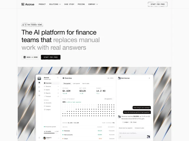
If you're in a batch and need a site this week, our Accrue template was built for the moment before a raise: 20+ pages for an AI or SaaS company, from $99. We compared it with 13 others in the best Framer templates for SaaS. If you want it designed around your product, a custom landing page starts at $1,999 and goes live in about a week (what a Framer website costs, in full); see our AI startup website design and SaaS website design work, or book a 15 minute call and we'll go through your homepage with you.
Sources: YC's Design Review episodes with Garry Tan and Pete Koomen, and the YC startup directory, checked 14 November 2026.